cookandkaye

scientific and technical website design projects news

Articles on website design

WordPress templates

Customisable templates for WordPress have been available from third parties for some years now, these allow anyone (with the time) to create truely unique websites that are (with a bit of design flare) attractive and engaging. This facility is now available to everyone using WordPress – it shipped free with the latest WordPress template ‘twentytwentytwo’!

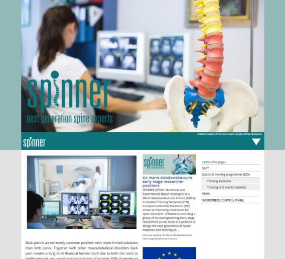
This development was immediately of interest to us, as we had a client looking to build a low-cost site that never-the less included a lot of quite complex, but customisable, layout. Armed with the new templating system we set off to see if it could be leveraged to deliver this. Our objective was to build a home page similar to in the visual below:

Here the home page template would have been called on to change most items in the main banner – namely a floated png of the vehicle, the ‘Test drive …’ message and the background graphic. With a conventional site, this degree of customisation is problematic using just the WordPress block editor (which has a tendency to fall over if the layout gets a bit tricky). To get around this we would have added a plugin to help the client through the process of editing the components for the home page in the WordPress administration section. Clearly if we can avoid having to customise one of our back-end plugins then we could save money on the build, and get a website that might be ‘more compliant’ to what WordPress is trying to achieve with its CMS.

Unfortunately, we ran into a lot of problems, the most critical being that we could not switch to a custom home page in place of the standard blog-roll, so we ended up with posts on the home page, and no way to replace this with our customer facing message …

This is perhaps only to be expected – the templating facility is still labelled as ‘in beta’ (February 2022). It does, however, demonstrate a lot of potential for the future, and we will doubtless re-visit this topic soon.

A brief history of customisable templates

A CMS driven website typically has a pretty rigid skeleton, within which the client (this might be you) can change the content, and has some limited control over how this content is layed out. Until comparatively recently, control over layout meant floating images left or right, and adding pre-defined blocks of ‘featured text’ (block quotes and headers pretty much sums it up). The new WordPress block editor allows the client to create some pretty complex content layouts if they have the patience. The header and the footer, however, are still usually hard coded. Occasionally you will get a widget area in these sections that you can make some changes to – but unless you are happy to write custom HTML/CSS you are stuck with the layout your designer created for you in these sections.

A customisable template allows you to take control of all aspects of your site layout!

Many users want the freedom to change all aspects of their layout, so it is no surprise that customisable templates are not a new concept. Early versions of WordPress allowed you to hand edit the template in the administration section, but this turned out to be a really bad idea. You needed to be able to write and understand HTML and CSS to get anything that looked half decent, but easy access to the code editing facility offered a great opportunity for hackers to do whatever they liked with your precious site (and they did). As a consequence, for a long while templates were hidden away from the admin panel; and left to the designer.

Modern templating systems avoid many of the pitfalls of giving, potentially malicious, users access to code presented to visitors. They are strongly focussed on layout elements, rather than offering a complete virus factory, but they do still come with some warnings attached:

A custom template capacity adds load to your hosting environment, and you need to be aware of this and ensure that your site is properly resourced. In many ways custom templates are the antithesis of our design philosophy over the last decade, where we have worked to build untra-light websites that can run quickly and efficiently. To combat this some of the better templating facilites do offer some optimisation facilities – and if you are going to use them, you should look out for these options in their control panel!

While most of our design at CookandKaye is for laboratory based personel in HE environments, where phones are not heavily used, typical visitor data for other sites shows that most of your visitors will visit your website on their mobile phone. To account for this your site should be flexible, it needs to accommodate your visitors irrespective of the type of device they are using. The templating and editing systems should come together to help you there – but you must remember to check how the site looks on a phone screen (assuming you are designing on a larger device!).

Some of our clients have already started the journey of designing and building their own, fully customised, websites. Many, however, do not have the time or inclination to take on what is a tricky design project that needs to balance a lot of requirements if it is to result in a usable interface fo their intended public!

Even if our clients do not want to take on the role of web-designer, the custom template facility will greatly lower the bar for new site developers. The need for an understanding of HTML, CSS and Javascript in a web designer is coming to an end…

TFI Network+

Screenshot from the TFI Network+ website.

The UK’s Engineering and Physical Science Research Council has provided £2M of funds to form the TFI Network+, which has the objective of connecting scientists and UK foundation industries (glass, concrete, ceramics, paper and chemicals) to remain competitive whilst simultaneously facing challenges from environmental legislation.

The website offers a membership section, within which members can find partners, and submit proposals for funding. Each proposal consists of two uploaded documents – the personal details of the applicants, and the annonimised application itself. Within the administration section proposals to each funding call can be viewed, and proposals can be scored to easily rank them prior to making funding decisions.

The membership section is based on our well established work for Society websites, while the proposal upload section is a custom development for this project. We also developed the Network logo and site design in consultation with the clients.

The original home page featured an interesting application of the CSS ‘stick’ class, but the TFI Network administrators have taken on content managment very pro-actively; reflecting the dynamic nature of this are of research. TFI Network administrators typically publish several articles a week covering all aspects of energy and resource efficiency in the foundation industries, demonstrating what you can do in WordPress with a dedicated and talented group of content providers. (Updated February 2022).

George & Dragon, Lancaster

George and Dragon logo, remastered from the pub-sign original by Barry (Sept. 2020).

The George and Dragon is one of the oldest pubs in Lancaster – it has been serving beer for longer than many coutries have existed! It was a great pleasure to work with Mike and Anne to develop this new website for them – allowing visitors to check what is available without crowding around the bar.

The new website is driven by a custom administration section that allows Mike to add new beers to his cellar, and put them on the virtual bar at the click of a button. The one-page site is built around Google’s ‘Rich Results’ platform, providing meta-data to help publicise opening times, current selection of beers, and events (when these become possible).

The George and Dragon Pub on the historic Quay in Lancaster. (Photo by Barry Nov. 2017)
the George and Dragon (center) on the historic quay in Lancaster.

With the relaxation in COVID-19 rules, table service is no longer offered.

The George & Dragon pub, Lancaster

Blockprint your mug with SVG!

We’ll start with a real webdesign conundrum: How do you build a site that is interesting, but does not overload my server, your data-connection, or your device’s processing capability. I guess you might also appreciate my not using up all of this months data allowance too!

You can start block printing your mug design with this traditional gardener’s plea: Grow, damn you!

Flower blockprint dev

Here I have built a large-ish graphic using the block printing concept; a concept I first encountered on the mugs my mother owned in the 60’s. The design is generated by repeating three simple graphical elements. When you click the ‘Grow, damn you!’ link these are assembled in a step-wise fashion to generate a pseudo random pattern. I believe there are 274 million different final designs possible (see wikihow.com); most permutations look OK, though some are more visually interesting than others.

Does it work? Well, if you have read this far, then yes! Putting this into numbers for comparison; the code required to generate the block-print comes in at under 4kB. The photograph shown below comes in at 44kB…

Photograph of a wildflower.

I think both images are quite pleasing; clearly they would serve very different roles in a website, and would be used in different circumstances. When a technique like this is appropriate, however, you can enhance your visitor’s experience, at minimal cost to yourself OR to your visitor (what is not to like?)*

If you like the design you have generated you can get it printed on a mug at the T shirt Studio (link below), but you will need to zoom in on the graphic (it is SVG, so you can zoom the page as much as you need without it pixelating – this will not work for the photograph;-), and grab a screenshot first – as the design will (almost certainly) be different the next time you visit!

tshirtstudio (other online printers are available).

* Custom art is ALWAYS expensive to create; the saving is in ensuring your server gets pages to more (up to 10× more) potential visitors (customers?) for the same infrastructure cost!

Mobile statistics (2)

In 2015, we noted that access to websites through mobile devices was a vital consideration in any new website design. Back then the headline figures from Ofcom were somewhat exaggerated, being based on kB of data transferred, but claimed 61% of web traffic was through mobile devices. This was not reflected in statistical reports based on visitor numbers to ‘normal’ websites, or in own observation of browsing statistics on client’s websites.

A personal glimpse of current browsing habits (July 2020), suggests that our client’s websites are now more closely in-line with the earlier Ofcom report:

Visitors to commercial websites now split approximately evenly between desktop and mobile devices, while visitors using a tablet come in at about 20% of the total.

Visitors to our academic websites, in contrast, have more conservative browsing habits: Most academics have access to a larger desktop device which they use for research, and the statistical split is closer to 80% on desktops, with most of the remaining visitors being on smaller mobile devices, and only about 1% accessing sites through tablets. For some academic sites there will also be issues with getting access to an internal site that is only available over a VPN, but that is not a factor in these statistics.

Despite the change in visitor profile, very few modern websites pay more than lip-service to design for mobile use. The design principle stops at cramming a large desktop site (that the boss sees in the design briefs) into a smaller format, with no consideration to the reduced processing power and bandwidth that these devices have access to, or increased cost a visitor may experience in downloading a graphics heavy website…

Wilkinson Charitable Foundation

Logo of the Wilkinson Charitable Foundation.

The Wilkinson Charitable Foundation was established under a Trust Deed made by the late Professor Sir Geoffrey Wilkinson in 1978. Sir Geoffrey Wilkinson needs no introduction to fellow chemists, being the 1973 Nobel Prize winner for his work developing Organometallic Chemistry, but also as the co-author of ‘Cotton and Wilkinson’ the standard undergraduate inorganic chemistry text for many years.

The Foundation has been acting behind the scenes for many years, offering studentships and prizes for chemiatry related activities. Recently the board decided that the Foundation would be better served by having an online presence.

We used a standard WordPress template (‘Twenty Seventeen’), minimising development costs for the Foundation whilst providing a fully featured website. Our role was in helping to prepare content for inclusion in the site, including images and video hosting.

UK Society for Biomaterials

The UK Society for Biomaterials (UKSB) is a non-profit organization working to develop novel biomaterials to tackle current clinical needs for medical devices, prosthetics and for regenerative medicine. Their membership interests include medical materials science, biosensors, biomechanics, biocompatibility, tissue engineering, and many other subjects.

The site is fully mobile compatible. It is built in WordPress, to permit the society to add and edit content, and includes a separate membership section, where members can add a brief profile and gallery of work to illustrate their scientific activity.

Screenshot of the UKSB website from a mobile device.

The WordPress installation has a custom Newsletter (see our previous post on society newsletters), and facility for uploading banner images. Banner images are automatically saved at multiple resolutions to optimise site performance – lowe resolution images being served initially, and for mobile devices, to ensure the site responds quickly to visitor requests. Higher resolution banners download after the page has been displayed, and quietly replace the low res. version, giving the appearance of the image snapping into focus. On mobile devices the iinitial low res. version is adequate for the smaller display area, and a high res. version is not downloaded to save the visitor’s bandwidth costs.

Membership payments, including a reminder system, are automated. Payments are made through PayPal.

Electronic and photonic molecular materials website

We created the Electronic and photonic molecular materials website a number of years ago. The design was based on that used at the time by the University of Sheffield, of which the research group is a part, and is still quite visually striking and effective (a lot more easily used and navigated than a modern ‘bootstrap’ site!) – on a desktop browser…

Over the decades the underlying mechanics of the web have changed – today sites need to be mobile friendly! There was a need for an inexpensive site update that would make the site accessible to mobile/phone format browsers, and work with a new HTTPS certificate.

The original home page had a series of eye-catching full page images displayed in a slide-show. The new home page serves one of three full page images tailored to wide screen, tablet and phone screens*. This reduces the bandwidth needed on mobile devices, which do not need to pull down the large format photographs, and so makes browsing the site a lot less painful on these devices. The low budget meant that we have lost the slide-show, so different banner images are served at random, with a new image being selected each time you visit the home page.

EPMM mobile screenshot

Above: A screenshot of the new Mobile-friendly EPMM website. The items in the menu bar were just a little too wide to fit comfortably accross a smaller mobile screen, so the link to the Department of Physics and Astronomy has been disguised as a shorter (but well known) equation (where else would you expect to go with the link F=ma?) …

* This used the HTML5 ‘picture’ element with artistic direction; so we have carefully chosen sections of the large image that give best impact at successively smaller screen sizes. The picture element is not available on Internet Explorer (note, this browser is now obsolete), or on older iOS devices. In these instances the visitor gets the rather over-large banner image.

SPINNER logo design

Part of our remit for designing the Spine repair training website (SPINNER) was to develop a new logo and icon for them. Their initial ideas had focussed on a web spinner in medical greens – which was quite attractive, and reflected the name of the programme, but not its role…

We therefore looked at introducing a more’spinal’ quality to the logo design: Our initial design sheet investigated using ‘s’ shaped spine as the initial ‘S’ in spinner, printing the spinner name with each letter on a separate vertebra, and placing the initial ‘S’ on a single vertebra.

Through discussion with the client, and many itterations, we came to the final design, in which the spine is used as the body of the ‘i’, with the dot at the head.

The final SPINNER logo
Above: the final version of the SPINNER logo.

The logo was built as a vector format (SVG) image, and is used on all pages of the site. The logo is also used in the site icon, and the apple-touch-icon. The best format for the latter is a subject of some debate amongst web professionals (see Apple touch icon: The Good, the Bad and the Ugly from Favicon’s blog), we create a 120x120px square icon as a standard for our website clients.

The vector format allows us to scale the image without distortion, permitting us to easily create versions for high resolution print work.

Spine repair training website (spinner)

Spinner home page screenshot

The new SPINNER-EID website is the online presence of a European training network focussing on Numerical and Experimental Repair strategies for the human spine. Training focusses on developing new materials and techniques, and brings together the Universities of Bologna and Sheffield, the leading medical manufacturers from around Europe, and the National Centre for Spinal Disorders in Hungary. The SPINNER group is currently (April 2018) recruiting suitable students for their doctoral training programme; for more details visit:

SPINNER-EID website

The site is built in WordPress, to enable the management team to add new content and develop an online community for students working in a number of locations accross Europe. The site itself has a modern appearance, and most design houses achieve this by adding packages such as ‘Bootstrap’ to the core WordPress package. This generally results in a site that has a very large number of download dependencies – the site cannot be displayed until a large number of libraries have been downloaded. As you might expect from the name ‘library’, each of these downloads adds a lot of cuntionality to the site, unfortunately the designer is usually only employing a few lines of code from each…

Lean design improving the visitor’s browsing experience

In contrast, our own approach is one of ‘lean design’, functionality is supported by the minimum amount of code possible, and this is deployed in as few download packages as we can manage (two style sheets, one for site styling, the other providing the Open Sans font used for text on the site). Ths obective is to improve the browsing experience for visitors, by reducing page load times, which is particularly an issue over mobile networks (especially if you are paying by the MB for your data connection!).

The philosophy is carried over to the custom home page slide show. This downloads a low resolution image in the first instance, so the page can be rendered quickly. Once the page has been loaded, code checks the display width – if you are on a mobile device, nothing more will happen, so you will not stack up bills downloading big photos that your phone cannot display anyway…

If you are on a wide screen desktop, however, the site will offer a high resolution image to replace the initial quick download. If you look carefully, you will see the banner image snap into focus as this happens. The ‘focus snap’ effect is subtle, but quite pleasing in itself (take a look)…

Code standards are to W3C HTML5 and CSS3/SVG.