Working with CSS3: the shape of the web to come
The new features available in CSS3 are increasingly important to web designers. A number of our sites now offer flexible templates, that change the layout of a page for hand-held devices, improved background control properties to paste an image over the entire device screen; elsewhere on the web drop-shadows and embossed text are now very popular…
Our new micro-site for Lochaline Dive Centre, however, offers us the opportunity to be a bit more relaxed about the way we approach CSS3. A pure advertising site, this is aimed at casual visitors, rather than committed customers, to increase the profile of the dive charter boat service available from the Centre. If the site falls over for a few visitors, it is no big deal, we are looking to make an impression on people using up-to-date tech… So what eye-candy can we throw at them, and what lessons do we learn about CSS3 in the process of creating the site?
Planning our CSS3 test site
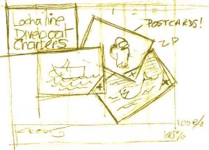
Design concept: A set of postcards, featuring the dive boat charter services offered by Lochaline Dive Centre, scattered onto the browser window.
Interaction: Visitors must be able to intuitively interact with each image – bringing any card to the front to view the image, and reverse the card to read the message on the reverse.
Universal media: The layout and scale of the cards should change to reflect the size of the browser ‘stage’ available to the web-page.
Animation: When the page loads the postcards should be off-screen. They should then float into the browser window, as though dealt one by one onto the screen.
The question is, how much of this can we do with the new CSS3 markup, and how much will we have to look to the programming layer (Javascript) to achieve the effect we want?
The project is being built in a number of iterations, so there is some interest in seeing how many of these targets we can hit just using CSS3, and how many compromises we are obliged to make in our original design concept…
Anecdote: The original design (above) is on paper, which I still find to be the fastest way of laying out an idea. In annotating it for this post, I made a mistake (looks like ‘ZP’) – my immediate reaction was to look for CTRL-Z to undo this. Our expectations from a digital world encroach on ‘the real’.
CSS3.1 – the next post with the layout of the post cards
If you are interested in diving some of the great wreck sites in the Sound of Mull, you can check out Lochaline Dive Centre’s main website at:
Lochaline Dive Centre – dive boat charters
Articles in this series:
- THIS ARTICLE Working with CSS3: the shape of the web to come the dive boat charter micro-site concept and sketch layout
- CSS3.1: The final depiction of the cards showing the basic layout of the cards. The layout here copes with displays between 300px and 1200px wide. Wider displays leave the site stranded in the centre of the page see: CSS3.1 : Dive boat charters test site v1
- CSS3.2 Improved display on wide screens and mobile devices working with very wide displays using industry standard techniques, and looking at how we might future proof the design
