Spine repair training website (spinner)
The new SPINNER-EID website is the online presence of a European training network focussing on Numerical and Experimental Repair strategies for the human spine. Training focusses on developing new materials and techniques, and brings together the Universities of Bologna and Sheffield, the leading medical manufacturers from around Europe, and the National Centre for Spinal Disorders in Hungary. The SPINNER group is currently (April 2018) recruiting suitable students for their doctoral training programme; for more details visit:
The site is built in WordPress, to enable the management team to add new content and develop an online community for students working in a number of locations accross Europe. The site itself has a modern appearance, and most design houses achieve this by adding packages such as ‘Bootstrap’ to the core WordPress package. This generally results in a site that has a very large number of download dependencies – the site cannot be displayed until a large number of libraries have been downloaded. As you might expect from the name ‘library’, each of these downloads adds a lot of cuntionality to the site, unfortunately the designer is usually only employing a few lines of code from each…
Lean design improving the visitor’s browsing experience
In contrast, our own approach is one of ‘lean design’, functionality is supported by the minimum amount of code possible, and this is deployed in as few download packages as we can manage (two style sheets, one for site styling, the other providing the Open Sans font used for text on the site). Ths obective is to improve the browsing experience for visitors, by reducing page load times, which is particularly an issue over mobile networks (especially if you are paying by the MB for your data connection!).
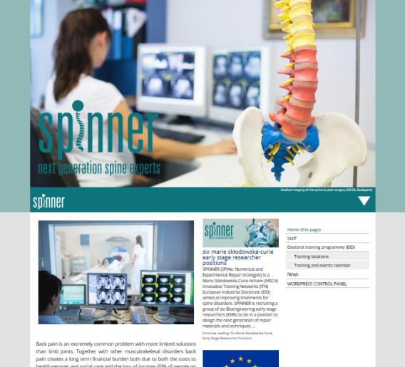
The philosophy is carried over to the custom home page slide show. This downloads a low resolution image in the first instance, so the page can be rendered quickly. Once the page has been loaded, code checks the display width – if you are on a mobile device, nothing more will happen, so you will not stack up bills downloading big photos that your phone cannot display anyway…
If you are on a wide screen desktop, however, the site will offer a high resolution image to replace the initial quick download. If you look carefully, you will see the banner image snap into focus as this happens. The ‘focus snap’ effect is subtle, but quite pleasing in itself (take a look)…
Code standards are to W3C HTML5 and CSS3/SVG.